01Portrait
Editorial Portrait
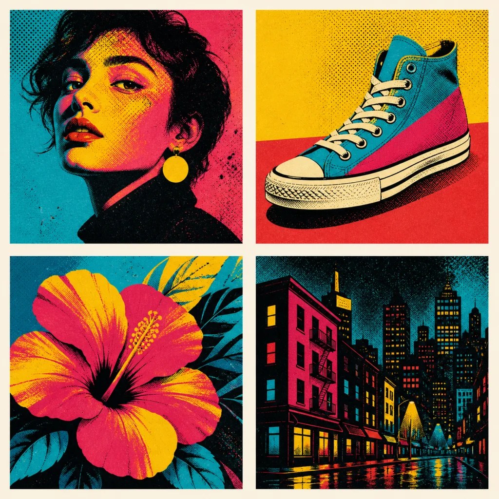
Cyan shadows, magenta midtones, and yellow highlights transform a face into a vivid poster image.
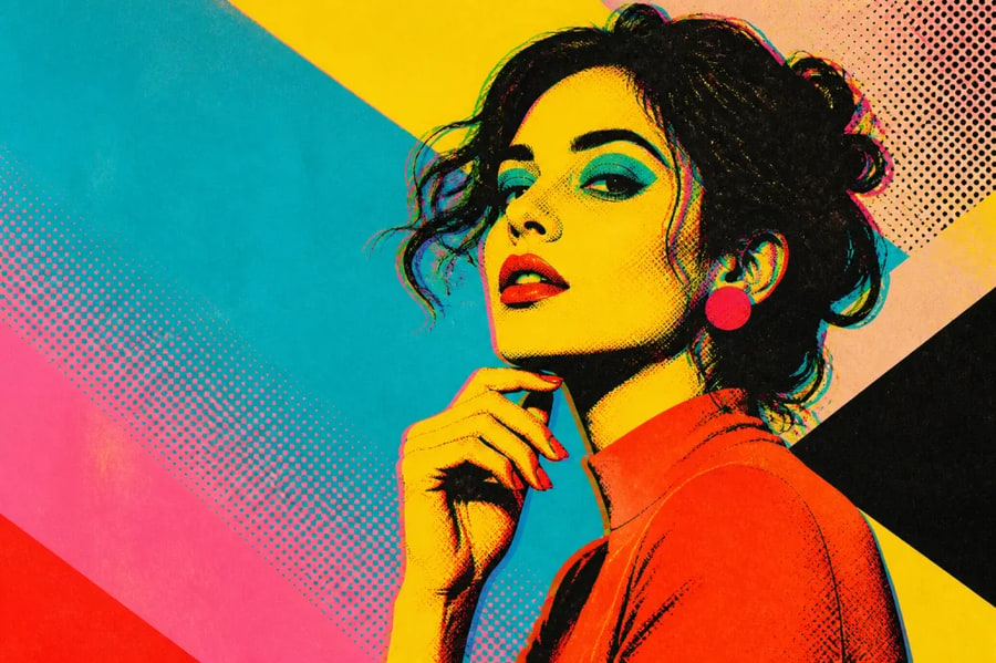
Bold color blocks · halftone texture · original editorial art
Turn portraits, products, flowers, and city photos into bold pop art. Direct vivid color blocking, halftone dots, black ink, paper grain, and offset print texture for a graphic editorial result.
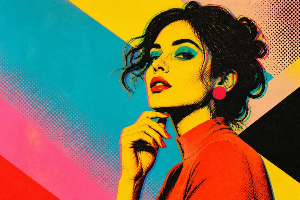
Bold color blocks · halftone texture · original editorial art
01 / Visual directions
Pop art works through selection and repetition: a strong subject, a limited high-contrast palette, bold black structure, and print texture that feels deliberately imperfect.
Cyan shadows, magenta midtones, and yellow highlights transform a face into a vivid poster image.
A simple unbranded sneaker becomes a graphic object through crisp black contours and flat spot colors.
An oversized tropical flower uses color separation and dot texture to balance nature with bold design.
Black architecture and saturated window light create a dramatic urban screen print with reflective streets.
02 / Why it works
Keep the face, object, or scene readable while rebuilding light and shadow as high-contrast color fields.
Add halftone dots, rough black ink, paper grain, color separation, and restrained registration offset.
Transform products, food, pets, architecture, plants, vehicles, and everyday objects into campaign-ready graphics.
Choose classic cyan-yellow-magenta, a duotone, brand-adjacent colors without logos, or your own limited ink set.
03 / Three-step workflow
Keep the source clear, describe one strong direction, then refine the output with deliberate changes.
Choose a portrait or object with clear shapes, directional light, and an uncluttered focal point.
Name three to five colors and request black contours, halftone dots, and paper texture.
Adjust color balance or dot scale, then download the version with the clearest graphic hierarchy.
04 / Questions
It transforms an image into bold graphic artwork using high-contrast color blocks, black contours, halftone dots, and print-inspired texture. You can control the palette, subject, composition, and amount of detail.
Portraits, products, flowers, pets, and architecture with a clear subject and readable lighting work well. Simple backgrounds help the new color shapes and black structure remain legible.
Yes. Specify three to five colors such as cyan, yellow, magenta, red, and black, or request a restrained duotone. Limited palettes usually produce stronger, more print-like results.
Ask for visible halftone dots, rough ink edges, uncoated paper grain, flat spot colors, and a subtle registration offset. Keep the offset restrained so facial features and object edges stay readable.
Not exactly. Halftone is a dot-based printing technique. Pop art may use halftone dots, but it also relies on bold subject selection, simplified color, repetition, graphic contours, and commercial-print energy.
Use broad visual descriptions instead, especially for living artists. Describe mid-century screen print, bold flat colors, halftone dots, comic-like contours, or offset ink without naming an artist to copy.
05 / Keep exploring
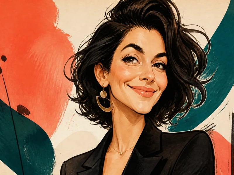
Turn a portrait into a lively illustrated caricature while keeping the person recognizable. Guide the expression, exaggeration, ink style, and color palette for gifts, profiles, and editorial artwork.
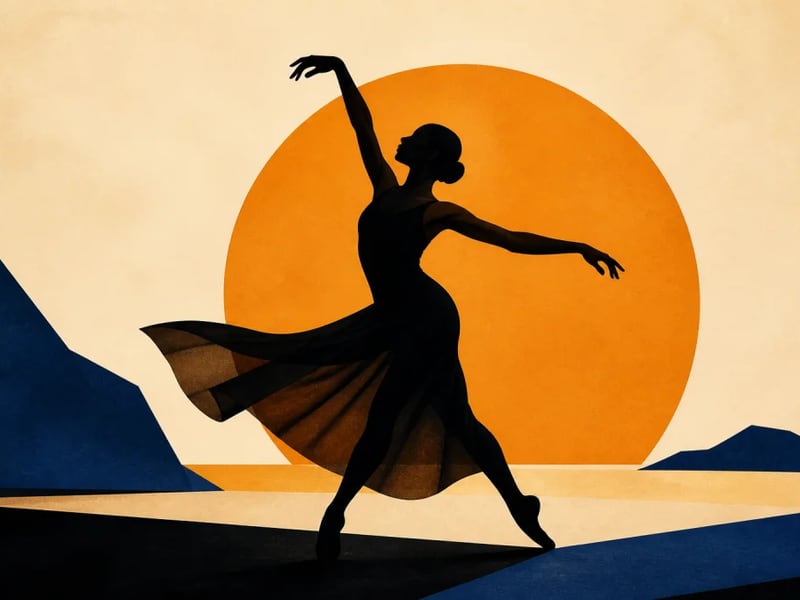
Turn a portrait, pet, object, or action photo into a clean silhouette. Preserve the identifying outline while simplifying interior detail for profile art, posters, crafts, and graphic compositions.
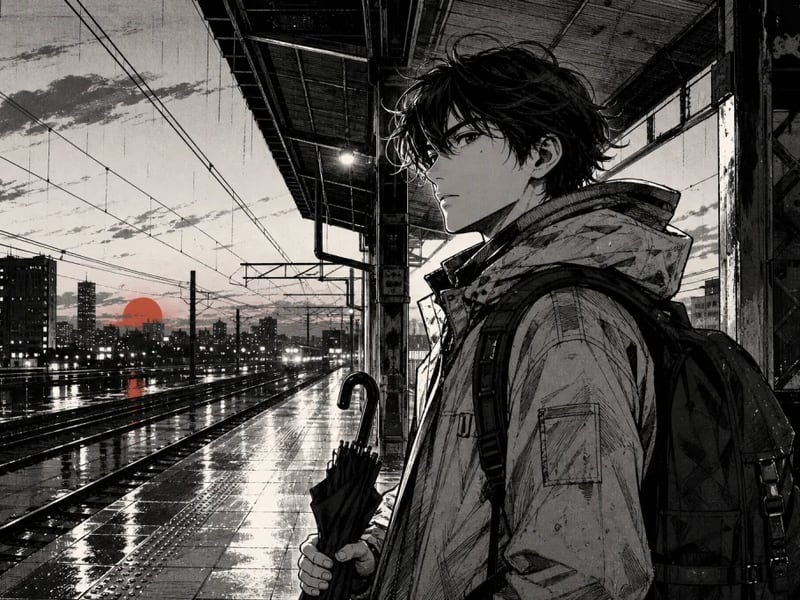
Create original manga-style characters and scenes from a photo or written idea. Direct the inking, screentone, expression, camera angle, and story mood without copying a named series or artist.
Upload a portrait or object, choose a fearless palette, and turn it into a tactile screen-print-inspired image.
Start creating